Notes on ML model evaluation
Dropping a link at the top: I wrote a python jupyter notebook showing using scikit-learn pipelines to loop over a number
of classifiers, and plot model evaluation performances of each, on (1) a cumulative ROC curve and (2) a Precision-Recall plot.
The notebook was so good, that some of my students stole it, edited it slightly, and turned it in as their own for another class.
I’m honored. ![]() u, class of 2019-2020.
u, class of 2019-2020.
Jupyter notebook showing scikit-learn pipeline model evaluation plots (ROC and PR-curve)
This post is a first-pass attempt to organize my thoughts for evaluating machine learning models, for my security analytics class. When I wrote this post, the program curriculum was such that my class was students’ first exposure to machine learning. This post is sprawling and ungainly, abandon all hope etc etc.
I use at least two paradigms in this post: CRISP-DM and the different “applications” of business analytics.
- Confusingly, “model evaluation” and “model interpretation” as described in this post both fit within the “evaluation” phase of CRISP-DM.
- The “applications” of business analytics include “descriptive analytics,” “predictive analytics,” and “prescriptive analytics.” This post touches on “descriptive” and “predictive” analytics.
There are two phases to statistical modeling:
- Creating the model (or “fitting” it)
- Using the model
Also consider: interpreting a model is different from evaluating it.
- Model interpretation asks the model to explain why it makes certain predictions.
- Model evaluation asks how good a model is at making predictions.
And, consider the following separate use-cases for statistical modeling:
- “Classical statistics” – descriptive analytics
- Machine Learning – predictive analytics
This is important: Both use-cases follow both modeling phases. Both use-cases fit models, potentially using the same model algorithms! It’s in how the models are used (phase 2) that the difference between “classical statistics” and “machine learning” is most meaningful.
The different uses are summarized as follows:
-
Classical statistics’ use-case is to test whether certain patterns exist in a dataset.
- A given dataset is used to fit a model.
- It is assumed that the dataset generalizes to a population of interest. However, whether the models generalize is not mathematically tested.
- With hypothesis testing (or structural equation modeling), relationships are
proposed, then data is collected. Then, whether the proposed relationships hold is statistically assessed.
- The model is “interpreted” to test proposed relationships. This is a hypothesis test.
- Models can optionally be “evaluated” for their own merit.
- This is not a hypothesis test.
- Classical statistics’ model evaluation metrics are sometimes called “goodness of fit” measures. These asks, “how welldoes this model represent the data from which it was derived?”
- Pay attention to this: this evaluation process asks the model to make predictions for data it was just trained on.
- That’s like giving a student a test with questions straight from a practice exam!
- The model doesn’t ace the exam, because the model was only allowed to learn general patterns from the practice exam. It wasn’t allowed to memorize answers. Hopefully.
- The goodness-of-fit is measured by the aggregate difference between predicted and actual values. These differences are called residuals.
- Because classical statistics models evaluation always only deal with data it was trained on, it is “descriptive analytics.”
- A given dataset is used to fit a model.
-
Machine learning’s use-case is to make predictions against new data.
- In machine learning, models are asked to make predictions for data they were not trained on.
- This is important – it is an explicit test of model generalizability.
- This is also important, because some models might be allowed to memorize training data. Such a model would excel when quizzed about questions it had memorized, but it would do poorly against questions it had never seen before.
- Machine learning does not necessarily care about any relationships between predictors in a model. It only cares whether a given model makes good predictions.
- To be sure though, there is a strong correlation – definitional relationship, even – between pattern-finding and predictive merit. A model that can’t find any patterns isn’t going to make predictions very well. But the point is, ML doesn’t (necessarily) care.
- Some brute-force modeling approaches may throw thousands of regressors into models. This would be unheard of in classical statistics. But both might use the same modeling algorithms!
- Because machine learning models are subjected to data they were not trained against, this is “predictive analytics.”
- In machine learning, models are asked to make predictions for data they were not trained on.
Model interpretability
Model interpretability asks what patterns a model found in its training data. It asks, “how does a change in predictor x impact predictions of y?”.
Model interpretability depends on whether the model formula produces tidy rules.
Regression models are just formulas, but not all models are simple formulas.
When models do produce formulas, the formulas represent the relationships
between the model’s independent and dependnet variables. Fundamentally, the formulas are very basic – simple y = mx + b stuff, where:
-
yis the dependent variable -
xis an independent variable -
mis a parameter weight found by the modeling algorithm -
bis an optional intercept. Its presence or absense has no impact whatsoever on model predictions, but it does change interpretation of raw model weights fitted for the X’s.
For classical statistics, modeling algorithms that produce readily-interpretable formulas like this are essential. This is because parameter weights are extracted from those models to test hypotheses.
However, for machine learning, it is not as important that the models be readily-interpreted. Therefore, much more obscure complex modeling algorithms can be used.
Interpretable algorithms include:
- Any of the regressors (linear, logistic)
- Decision Trees
- Naive Bayes (kind of?)
Uninterpretable (hand-waiving) algorithms include:
- SVM
- Neural Networks
- k-nearest-neighbors (no patterns extracted)
- RandomForest
However, uninterpretable models might be bad choices for machine learning applications. The problem of uninterpretability of some machine learning algorithm models is called the problem of “black box” models. For these models, it can seem impossible to understand “why” certain prediction were made.
Some machine learning applications must (arguably and sometimes legally) only use “interpretable” models, so that illegal or unethical bias in the predictions can be ruled out. For example:
- models which predict a loan-applicant’s credit-worthiness,
- models which predict a convict’s likelihood of re-committing a crime, and
- models which determine eligibility for access to special hospital appointment scheduling and financial resources
Models for such contexts should use algorithms which produce interpretable coefficients, decision paths, or other metrics for exogenous variables.
Examples of interpretable modeling algorithms include:
- decision trees
- naive bayes
- regression (logistic, linear)
Examples of modeling algorithms with poor interpretability include:
- k-nearest-neighbors (predictions dependent on other points in the training dataset, not on exogenous factors of the datapoint)
- neural networks (complexity of its layers resists human evaluation)
- SVM (with exceptions).
There are ways to interpret uninterpretable machine learning models
Note though, that “partial dependency” analysis techniques can provide a form of interpretation of any modeling algorithm’s models. These do not rely on models having simple underlying parameter betas. Rather, they systematically run tests to approximate relationships between input variables and outputs. It’s pretty cool.
It works like this:
- Feed training data into a modeling algorithm. You get a fit model.
- Select random data from the training data to feed into the already-fit model, to get predictions. Don’t input it yet.
- Choose one predictor from the selected data.
- For that predictor, choose a single value. Set all values for all data rows to that single given, chosen value.
- Get predictions for the manipulated data. Observe the distribution (average?) of the predicted values.
- Repeat step 3 until all reasonable values for the chosen predictor have been tested.
- Plot the distribution of target variables against the manipulated chosen values.
- Repeat steps 3 through 5 until partial dependency plots have been drawn for each predictor of interest.
The resultant partial dependency plots answer the question: “How does having a value of a for predictor x impact model prediction ys?”.
Again, pretty cool.
There’s also things like LIME and SHAP (shap supercedes LIME) for interpreting feature importances and effects, but I don’t want to summarize those here.
R vs Python for business analytics – which should be used?
There’s a holy war at my school, similar to the one between Vim and … what’s it called… emacs? (vim is life) between
whether we should teach students R or Python for their business analytics masters degree. I say, both have their place.
-
R- is great at “classical statistics” and descriptive analytics.
- yay
tidyverse!
- yay
- is horrible at “machine learning”
- and isn’t getting any better at it
- packages like
caretexist, but they lack standardized apis between algorithms.
- isn’t a contender whatsoever for analytics “devops” – deploying fitted models
- I’m sure some kind of
flask-app-to-serve-a-fitted-model exists, but I don’t know it - Probably there exist AWS sagemaker and GCP packages for R jupyter notebooks so that R can deploy models to the respective cloud platforms, but those don’t count.
- I’m sure some kind of
- is great at “classical statistics” and descriptive analytics.
-
python- is super great at “machine learning”
- see
scikit-learn– its algorithms’ comformant APIs and pipelines make swapping modeling algorithms a breeze.
- see
- is comparatively horrible at “classical statistics”
- but it’s getting better: see
statsmodels
- but it’s getting better: see
- is a swiss army knife of web programming and all else, and therefore is great for deploying ML models.
- is super great at “machine learning”
(You may not realize it because there’s hardly ever a reason to use it, but models that have been fit in R with lm have .predict() functions!)
R excels at “Classical Statistics”
Classical statistical libraries in base R provide nice print-out summaries of regression models, which allow easy interpretation of individual model variables. It’s what R was made for. Popular statistics software packages such as SAS and SPSS do the same thing.
Howeer, Python’s scikit-learn has no nice summary output view of a model’s parameters. But the statsmodels package provides
model summary print-outs comparable to R’s. Remember though that this only works for regression (formulaic?) models.
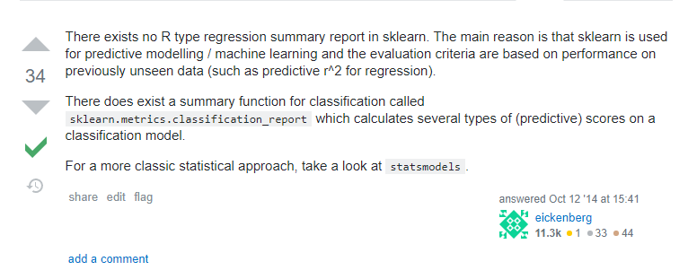
Image from this SO post
Evaluation metrics for machine learning models
Because the use-cases are entirely different between classical statistics and machine learning, the evaluation methods differ, too.
Both classical statistics and machine learning care about model prediction performance. But they care about it in starkly different application contexts. Classical statistics asks how well a model fits data it was trained on. Machine learning, on the other hand care how well a model can make predictions for data it has never seen before. Again, these are different because the use-cases for classical statistics and machine learning are different. Classical statistics is “descriptive analytics,” and machine learning is “predictive analytics.”
It’s common to make “clasifiers” in machine learning context. Specifically, ones that answer either “yes or no” questions. These are called “binomial classifiers,” and most classifier models make probability predictions (probability of “no,” probability of “yes”).
- Probability predictions can be converted to nominal predictions using a cutoff threshold.
- Nominal predictions can be displayed using a confusion matrix.
- Evaluation metrics such as the following can be derived from a given (single) confusion matrix. These all have synonyms from various fields of use.
- Accuracy (very common, but not very useful)
- TPR (a.k.a recall, sensitivity, “probability of detection”)
- FPR (1 - specificity)
- PPV (precision)
- F1 (harmonic mean of TPR and PPV)
-
An F-score (F1-score) is the harmonic mean of TPR and PPV. Harmonic mean is an alternative to an arithmetic mean, and is more appropriate when averaging things that are proportions.
A harmonic mean is the… deep breath… inverse of the average of the inverses of the given measures. [:exhale:] It’s a happy-medium between “how many of the actual yes-es did we say were yes-es” and “how often were we right when we said something was a “yes.”
-
- Types of errors:
- A Type 1 error is a False Positive, and therefore hurts (lowers) TPR
- A Type 2 error is a False Negative, and therefore hurts (lowers) specificity, and hurts (raises) FPR
Ploting Machine Learning Model Performance
Now, two key points to grok:
- A set of confusion matrices for a given classifier can be obtained by creating one confusion matrix for each possible probability cutoff threshold.
- If you have a set of confusion matrices, then you can get sets of evaluation metrics. Multiple metrics per confusion matrix. Keep the ones that came from the same confusion matrix grouped together.
- Sets of evaluation metrics can be plotted. Possible plots include the following:
- ROC curves
- Precision-Recall curves
- Lift curves
The below section is in really rough first draft form. This post is already long as-is. I may move it to a separate post.
Really, this whole post is more like a textbook chapter. Why is it on my blog? Hmm.
ROC curves
The set of all TPR and FPR metrics derived from the complete set of confusion matrices for a given classifier can be plotted on a ROC Curve – TPR on the y-axis, and FPR on the X axis.
ROC Curves do not depend on class priors. If your testing data does not have the same distribution as the population from which it was drawn, plots such as cumulative gain charts and lift charts, which plot predictions that have been sorted by probability scores, can be deceptive. ROC curves, however, plot two metrics which consider actual-positives and actual-negatives separately. Therefore, ROC curves will not change based on the ratio of classes.
A ROC curve also plots a “p-coin random guess” line – a line plotting the skill of a coin-flip classifier model. This model calculates a random probability between 0 and 1 for each test data point,
and if that probability is above a given threshold, it predicts a 1. If a threshold of x is used, say, .75, then a model would have a 25% chance for each test case of classifying it as a 1, and a
75% chance of classifying it as a 0. Therefore, 25% of the actually-positive cases will be predicted to be yeses (TPR of .25), and 75% of the actually-negative cases will be classified as no’s
(FPR of .25). Note that the above conclusion does not depend on the balance of actually-yes-es to actually-nos, since the classes are considered separately for these metrics. When the complete set of
TPR-FPR pairs is calculated from all possible thresholds, plotting the resultant set of points on a ROC curve results in a line drawn from [0,0] to [1,1]. This is called a p-coin because such a classifier
can also be considered flipping a maybe-weighted coin. For a fair coin, each datapoint has a .5-chance of being classified as a 1, while a weighted coin that flipped a 1 9 out of 10 times would give
each test case a .9 chance of being called a 1. A ROC curve for a given model had better perform better than a random coin flip for all of its possible thresholds. If it doesn’t then it would be better to
always predict the opposite of whatever the given model predicts. From such a classifier, turn away!
An area-under-the-curve can be calculated from a ROC curve to give a single metric that assesses the performance of a single classifier across all possible cutoff thresholds. This is equivalent to the ratio of total space that a classifier’s curve “fills” down to the bottom-right of the [[0,1],[0,1]] ROC-curve plot space. Higher AUC == good.
Precision-Recall curves
These are like ROC curves, except that they plot different metrics – TPR and PPV. These two metrics together only consider 3 out of 4 possible cells of a confusion matrix – the “true negative”s are ignored. The thought here is that in application, things relating to the “actual yes”-es and the “yes-prediction”s are more interesting. Note that these are the two metrics that make an “F1”-score. Therefore, AUC of a precision-recall curve is related to a cumulative averaging of the complete set of F1 scores across all possible cutoff thresholds for a given model.
A no-skill line on a precision-recall curve is not a line drawn from [0,0] to [1,1] – rather, for a set of random guesses, the precision, or proportion of time that a “yes”-guess is correct, is always equal to the proportion of actual-yes-values in the set of points from which the random sample was drawn. In other words, regardless of how often you guess “yes”, if you’re doing so completely randomly, you’re going to right at the rate that there are actual “yes”-es in the sample you are guessing against. Recall, on the other hand, will scale linearly with the likelihood of a no-skill classifier of guessing “yes”-es. Recall that recall is a measure of “of the actual-positive test-cases, how many were correctly classified?” The more often you guess “yes”, the more of the actual “yes”-es you’ll get right. See this explained with proper stats notation in this stackoverflow post
Lift curves
:todo:
Resources

Dave Eargle is a Senior Consultant in Cybersecurity Assessment at Carve Systems. More about the author →
This page is open source. Please help improve it.
Edit